As you enter the house, you will be met with a long, wide hallway painted in Crispy Gold.
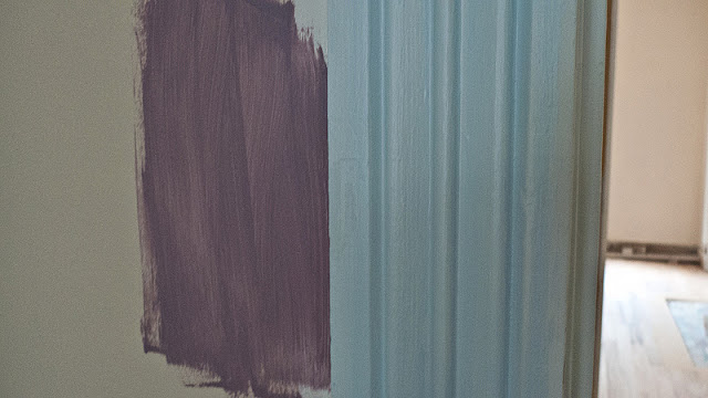
THIS is why you want to work with a professional when choosing paint colors. I would never in a million years have thought to use a light blue. I would've used a ho-hum off white and called it a day. This is Balmy, and we'll be using it on most of the interior trim and doors.
I finally get my purple bedroom! This will be in the master bedroom and it's called Mythical. The trim, of course, is Balmy. We might also paint one accent wall in the hallway this color, we're not entirely sure yet.
This is the wall color for the master bath. It's called Open Seas. Keep in mind that there will be a lot of white subway tile and white hexagonal floor tile in this room, so I think this blue will be a welcome pop of color.
The office is one of the few rooms where we haven't made our final color choice. If we go with stained ceilings in the office, we will most likely choose this greyer blue called Dutch Tile Blue. If we decide to paint the ceiling, we may go with a richer, darker blue. This will also be the color on the walls of the hall bath. It'll have beadboard wainscotting painted in Snowbound (not pictured, but it's an off white).
The addition (kitchen, living room, dining room) walls will be painted in this gorgeous autumnal orange called Red Cent. The cabinets in the kitchen and the built-ins in the living room will be painted an off white color called Antique White (not pictured). The island in the kitchen will be a specialized distressed finish done by Shea. Only she knows for sure what it will look like, but I know it will be stunning. Also, there will be a wall along the living room made up of old boards (meant to mimic an outside wall of our house). Shea will be painting it and distressing it too, and it's my understanding that it'll be a duo-tone purple/blue.
Various cabinets, shelves, and built-ins in our hall, office, living room and kitchen will have beadboard backing in them. This is a test of the colors we plan to use on the beadboard backing. From top to bottom, Red Cent, Mythical, and Cosmos.
Most of the beadboard ceilings in our house will be painted rather than stained. Here are two choices that we're considering, Copen Blue and Jetstream. We're not sure yet if we'll be painting all the painted ceilings one color, or if we'll choose between the two for each individual room.
Remember this picture? I posted this picture last week as a teaser of things to come. Here we are testing out various different purples for the exterior paint color of the house. After much deliberation, we decided to go for the one on the bottom called Soulful Blue (it's called blue, but I assure you it's purple).
And here you see it painted on the outside of the house!
Well that's it folks. Our contractor is on vacation this week, so he has his crews working on painting the house while he's gone. With any luck, I may be able to show you guys some completely painted rooms next time!


We're still looking at mid November at the earliest. I really hope we make it cause we only have the rental through Nov. 30, and I'd like to get settled in before the holidays.
ReplyDeleteWow! I can imagine what your house looks like when all of the paint is put on. Your house definitely has that autumn feel to it. What color does the office have? I think going for the Dutch Tile Blue would be a good choice because it’s very light on the eyes, and it has that very relaxing feel to it.
ReplyDelete@Anselm Armando
The soulful blue paint you used on your exterior was really great. Others may really insist that it’s purple though. Haha! Well, when it comes to paint, there are many variations of shades to choose from. The last time I repainted my room, it really took me a long time to decide what color to use. :p I ended up having a Turkish blue room.
ReplyDeleteWilliam Gulliver